Using Timeline Widget For Elementor, you can easily create timeline stories directly inside Elementor to represent your company history, product roadmap, personal achievements, and more.
Add Story Timeline Widget
Follow these simple steps to create a Story Timeline inside Elementor:
- From your WordPress dashboard, navigate to the Pages section.
- Click Edit with Elementor to open the page builder.
- From the Elementor widget panel, search “Story Timeline”.
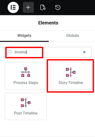
- Once added, you will see a default timeline structure appear on your page.
- Now you can customize the timeline stories using various settings like layout, colors, icons, and media.
- After being satisfied with all the changes, publish your page.
Timeline Settings
Once the story timeline widget has been added, you can customize stories using different settings.
Content Settings
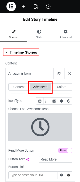
Inside the Content tab of the Story Timeline widget, you will find two main sections:
- Timeline Stories
- Layout Settings.
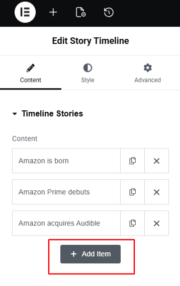
Timeline Stories: The Timeline Stories section allows you to manage the content of each individual story in your timeline.
From the Content Settings:
- Year / Label (Top): Toggle this option to show or hide the year or label above the story.
- Year / Label Text: Enter the primary year or label you want to display.
- Label / Date: Add a date or short label that provides additional context for the event.
- Sub Label: Use this field to add a supporting keyword, such as “Introduced,” “Updated,” or “Released.”
- Title: Enter the main heading for your story.

- Choose Media: Choose the type of media (Image, video or slideshow) that you want to include for your story.
- Description: Add the main content for your timeline story using the text editor. You can write a short explanation, list key details, or include additional media.

From Advanced settings:
- Icon Type: Choose the type of icon that you want to display for your story, from icon, text, image, dot or none.
- Read More Button: Enable this option to add read more button for your timeline story.
- Button Text: Enter the label you want to display on the button.
- Button Link: Add the URL where the button should redirect the user.
From Colors settings:
- Background Color: Sets the background color for this specific story box.
- Border Color: Changes the border color around the story container.
- Title Color: Controls the color of the story title text.
- Title Background: Sets a background color behind the title, helping it stand out.
- Description Color: Changes the color of the story’s description text.
- Label / Date Color: Controls the color of the label or date text in this story.
- Sub Label Color: Adjusts the color of any additional label or subtitle.
- Icon Color: Sets the color of the icon used for the story marker.
- Icon Background: Changes the background color behind the icon to make it more visible.
- Year / Label Color: Adjusts the text color for the year or timeline label.
- Year / Label Background: Sets a background color behind the year or label.
- Connector / Arrow Color: Controls the color of the connector line or arrow that links this story to the timeline line.

- You can repeat these settings for each story.
- To add a new story, simply click the “Add New Item” button.
Layout Settings
- Layout: Choose the layout for your timeline story according to your preferences.
- Preset Style: Apply a ready-made design to your timeline layouts.
- Connector Style: Choose the connector style for timeline stories.
- Display Icons: Choose the type of icons from custom or dot.
- Icon / Labels Position: Adjust the position of timeline icons and labels.
- Content in Popup: Enable this if you want the full story content to open in a pop-up when users click on a story.

- Image Pop Up: Enable this option if you want the story image to open in a lightbox pop-up.
- Animation: Choose an animation effect for how each story appears while scrolling.
- Image Out Of The Box: When turned on, the story image will appear slightly outside the story box.
- Navigation / Menu: Enable navigation buttons or menu to help users move through the timeline easily.

Style Settings
The Style Settings allow you to change the design of your entire timeline. From here you can:
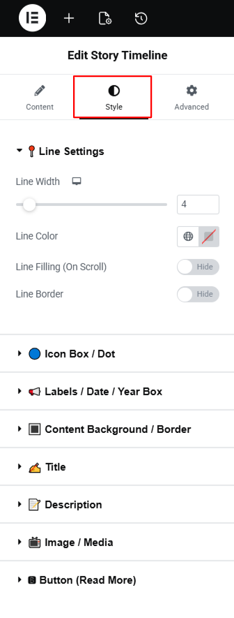
- Line Settings: Adjust the timeline line width, color, and border, and enable a scroll-filling effect. You can also set the border style, border width, and border color for the middle line.
- Icon Box / Dot: Set background colors for normal and active states, change the icon or text color, add borders, and adjust the size of the box or dot, including text size and corner radius.
- Label / Date / Year: Style the labels, dates, and years shown in each story. You can change spacing between labels, update colors, adjust typography, and customize the label size.
- Content Background / Border: Set background colors, gradients, or multi-color backgrounds. You can also add hover backgrounds and choose the border style, width, corner radius, and box shadow.
- Title: Choose the title text color, background color, typography, padding, and spacing below the title.
- Description: Change the description text color, background color, typography, padding, and bottom spacing.
- Image / Media: Set the image width, height, alignment, padding, margin, borders, and shadow.
- Button (Read More): Style the “Read More” button by adjusting its background color, text color, alignment, width, height, margin, and padding.
After satisfied with all the changes publish your page and preview it.