The Process Steps Timeline helps you display step-by-step processes in an organized timeline format. It is useful for showing workflows, instructions, onboarding steps, tutorials, manufacturing processes, business procedures, and more.
With the Timeline Widget Pro For Elementor, you can create process steps directly inside Elementor.
Add Process Steps
Follow these steps to add a Process Steps Timeline inside Elementor:
- From your WordPress dashboard, go to the Pages section.
- Edit the page with Elementor where you want to display your post timeline.
- From the Elementor widget panel, search for Timeline.
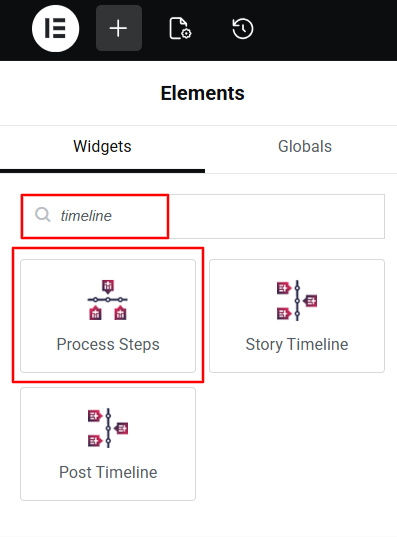
- Drag and drop the widget onto your page.
- A default process step timeline will appear, showing your latest blog posts.
Timeline Settings
Once the Process Steps Timeline widget is added, you can customize its appearance using the following settings:
Content Settings
Inside the Content tab of the Process Steps Timeline widget, you will find two main sections:
- Process Steps
- Settings
Process Steps: The Process Steps section allows you to manage the content of each process step in your timeline.
From the Steps Settings:
- Badge Text: Choose the badge text for your process steps timeline.
- Icon: Select the icon type from: Icon, Image, or Text.
- Title: Enter the title of your process step.

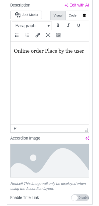
- Description: Enter the description to provide instructions or important information for your process step.
- Accordian Image: If you have selected accordian layout then upload accordian image
- Enable Title Link: Enable this option if you want to turn the step title into a clickable link. When enabled, you can add a URL to redirect users to another page.
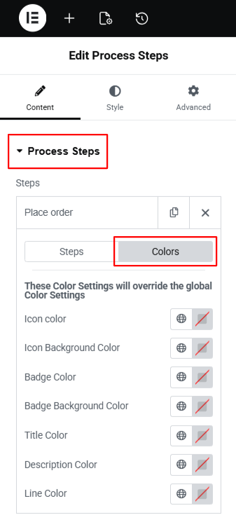
From the Colors Settings:
- Icon Color: Choose the icon color of your process timeline.
- Icon Background Color: Set the background color of your icon.
- Badge Color: Style the text color of the badge.
- Badge Background Color: Choose the background color of the badge.
- Title Color: Choose the color of the step title in your process timeline
- Description Color: Set the description text color according to your preferences.
- Line Color: Style the main connecting line of your process timeline.’
- You can repeat these settings for each step.
- To add a new step, simply click the “Add Item” button.

Settings: This section lets you customize the appearance of your Process Steps Timeline. You can choose different layouts and style them according to your website design.
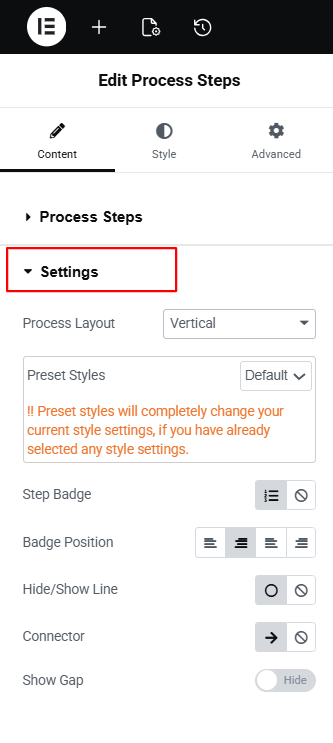
- Process Layout: Choose the layout for your process steps timeline from Vertical, Horizontal, and Accordion.
- Preset Styles: Apply a ready-made design to your timeline layout.
- Step Badge: Choose whether you want the step badge to appear on icon or not
- Badge Position: Adjust the alignment of the step badge.
- Hide/Show Line: Use this setting to show or hide the connecting line between steps.
- Connector: Choose the connector style according to your preferences.
- Show Gap: Enable this option to add space between steps in the timeline.
Style Settings
Using the style settings, you can customize the appearance of your process steps timeline elements.
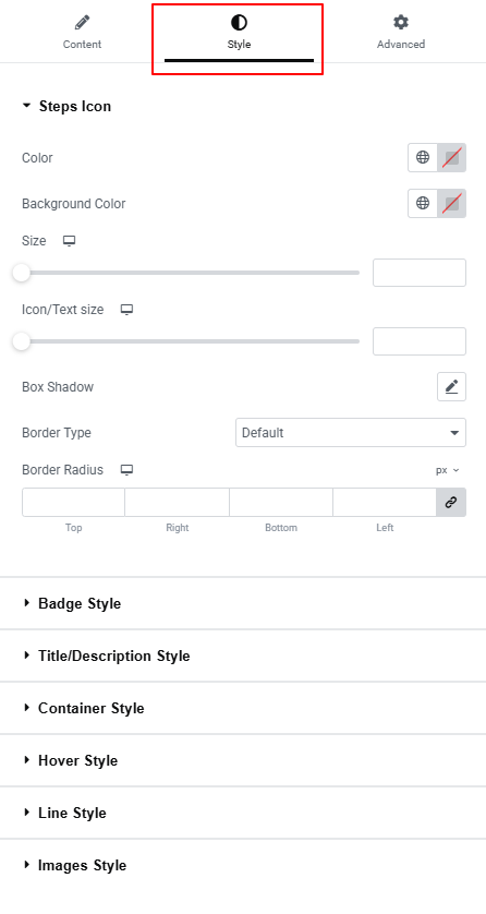
- Step Icon Settings: Customize the icon’s color, background color, icon size, text size, box shadow, border style, border width, border color, and border radius.
- Badge Style: Adjust the badge text color, background color, typography, border type, border width, border color, border radius, padding, and margin.
- Title/Description Style: Change the title color, title typography, title text shadow, and title margin. Change the description color, description typography, description text shadow, and description margin.
- Container Style: Use Bottom Spacing to control the space below each step
- Hover Style: Customize hover icon color, icon background, title color, description color, badge color, badge background, line color, and choose a hover animation with adjustable animation color.
- Line Style: Modify the line color, width, border style, border width, and border color.
- Images Style: Adjust the height of the image, apply a background color, and round the corners using the border-radius option.
After satisfied with all the changes, publish your page and preview it.