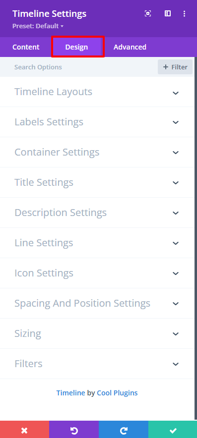
Using design settings, you can easily customize the appearance of your timeline stories by changing layout, colors, spacing, fonts, icons, and more.
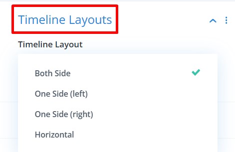
- Timeline Layouts: Choose timeline layout from vertical (both sides), vertical (one side), or horizontal layout.
- Label Settings:
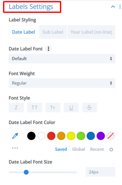
- Label Styling: This section includes three tabs to style different label types: Date Label, Sub Label, or Year Label.
- Date Label Font: Choose the font family for the Date Label text.
- Font Weight: Controls the width of the Date Label text. Example values: Regular, Medium, Semi-Bold, Bold.
- Font Style: Enable or disable different text styles.
- Date Label Font Color: Pick a color for the Date Label text using the color palette. You can also use Saved, Global, or Recent colors.
- Date Label Font Size: Adjust the size of the Date Label text using a slider.
- Container Settings:
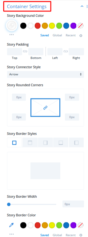
- Story Background Color: Set the background color for the story container box.
- Story Padding: Apply internal spacing inside the story container.
- Story Connector Style: Choose how the story connects to the timeline line from Arrow, Line, etc.
- Story Rounded Corners: Set the radius of each corner of the story container.
- Story Border Styles: Select the border type for the story box.
- Story Border Width: Set the width of the border.
- Story Border Color: Choose the story border color.
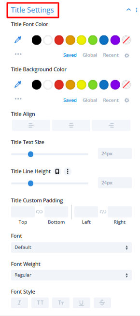
- Title Settings:
- Title Font Color: Set the text color for the story title.
- Title Background Color: Choose a background color behind the title.
- Title Align: Select the alignment of the story title: Left, Center, or Right.
- Title Text Size: Change the size of the story title text with the slider.
- Title Line Height: Adjust the vertical spacing between lines of the title text.
- Title Custom Padding: Add padding around the title area.
- Font: Choose the font family for the story title.
- Font Weight: Select how bold or light the title text should appear.
- Font Style: Enable text styling options for the title.
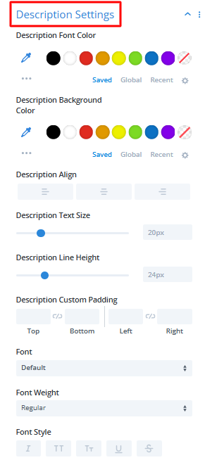
- Description Settings:
- Description Font Color: Choose a color for your story description text.
- Description Background Color: Set a background color behind the description text.
- Description Align: Align the description text to the left, center, or right.
- Description Text Size: Adjust the size of the description text using the slider.
- Description Line Height: Increase or decrease the spacing between lines of text.
- Description Custom Padding: Add extra spacing around the description content inside the story box.
- Font: Choose a custom font family for the description.
- Font Weight: Select how bold or light you want the description text to appear.
- Font Style: Choose the font style for description text.
- Line Settings:
- Line Color: Choose a color for the main vertical/horizontal timeline line.
- Line Width: Adjust the width of the timeline line.
- Show Line Filling: Enable/disable animated line filling on scroll. If enabled, the timeline line fills with color as the user scrolls.

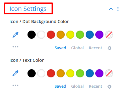
- Icon Settings:
- Icon / Dot Background Color: Set the background color of the story icon or dot.
- Icon / Text Color: Select the color for the icon or text inside the dot.
- Spacing And Position Settings:
- Labels/Icons Position: Adjust the labels and icons position.
- Gap Between Labels: Set the vertical or horizontal gap between labels (for date or year labels).

- After being satisfied with all the changes, publish your page.