From advanced settings, you can adjust the design of all timeline story elements like icons, labels, center lines, media, and more.
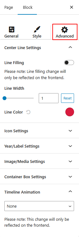
- Center Line Settings:
- Line Filling: Toggle this on to fill the center line with a specific color.
- Line Width: Customize the line width.
- Line Color: Pick the color for the center line.
- Icon Settings:
- Box Size: Set how large the icon box should appear.
- Font Size: Adjust the size of the icon inside the box.
- Box Radius: Control how rounded the icon box corners should be.
- Icon/Label Position: Shift the icon and label position using the slider.
- Background Color: Set the background color of the icon box.
- Font Color: Choose the icon text color.
- Connector Style: Select the line style that connects stories (Arrow, Line, or None).
- Year/Label Settings:
- Box Size: Set the size for the year or label box.
- Box Radius: Round the corners of the label box.
- Background Color: Set the background color for the year/label.
- Year Navigation: Toggle to add a year navigation bar.
- Image/Media Settings:
- Width / Height: Set custom image dimensions.
- Padding: Adjust space inside the image/media container.
- Margin: Add space outside the image/media container.
- Border: Define a border around images/media.
- Border Color: Pick a color for the image border.
- Container Box Settings:
- Margin: Add space outside the entire content container.
- Padding: Add space inside the container for better spacing around content.
- Border Width: Controls the border width around the timeline container.
- Border Radius: Adjusts the corners of the timeline container.
- Background Color: This sets the background color for the timeline container.
- Border Color: This sets the border color for the timeline container.
- Box Shadow: Add a shadow effect around the container.
- Timeline Animation: Implement animation effects to your timeline stories, like fade in, slide up, and 15+ more.
- After being satisfied with all the changes, publish the page and preview it.